Client: Gatsu-Gatsu
Agency: ©WeWantMore
Agency: ©WeWantMore
Branding, Illustrations, interior brand integrations

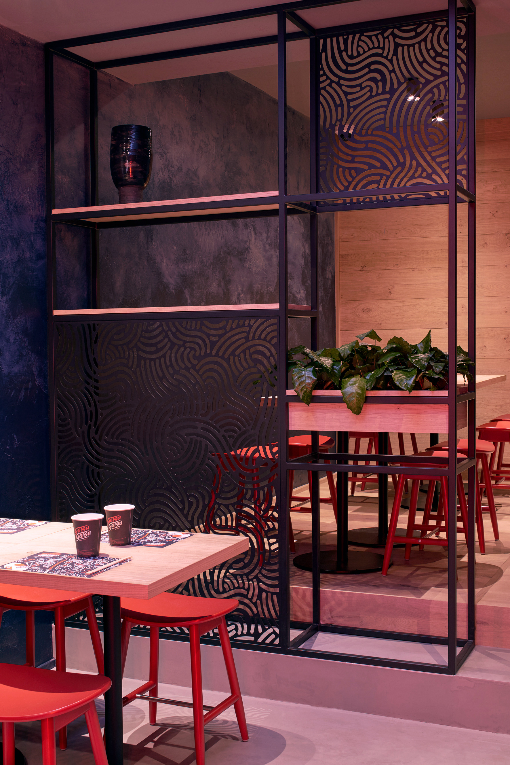

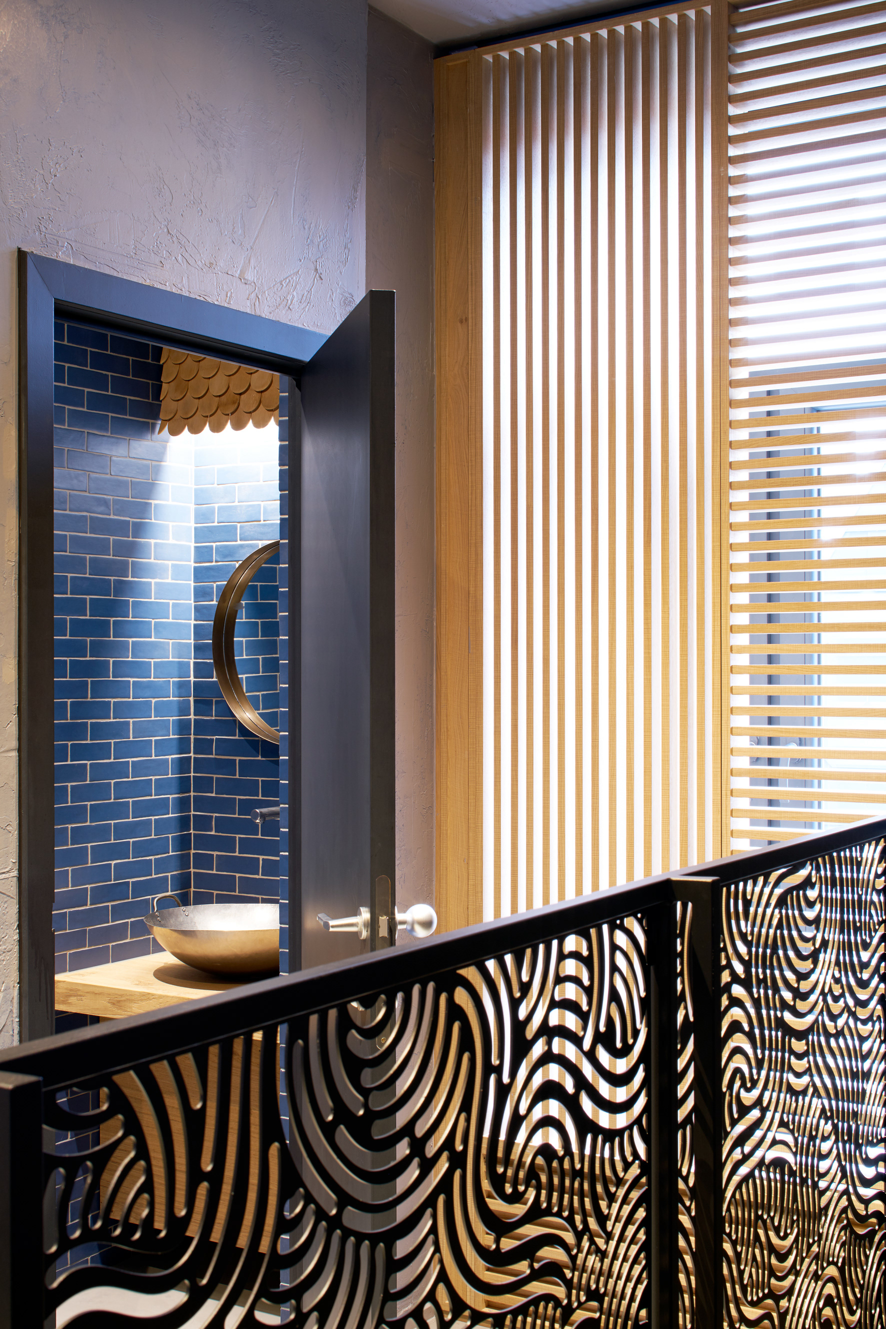

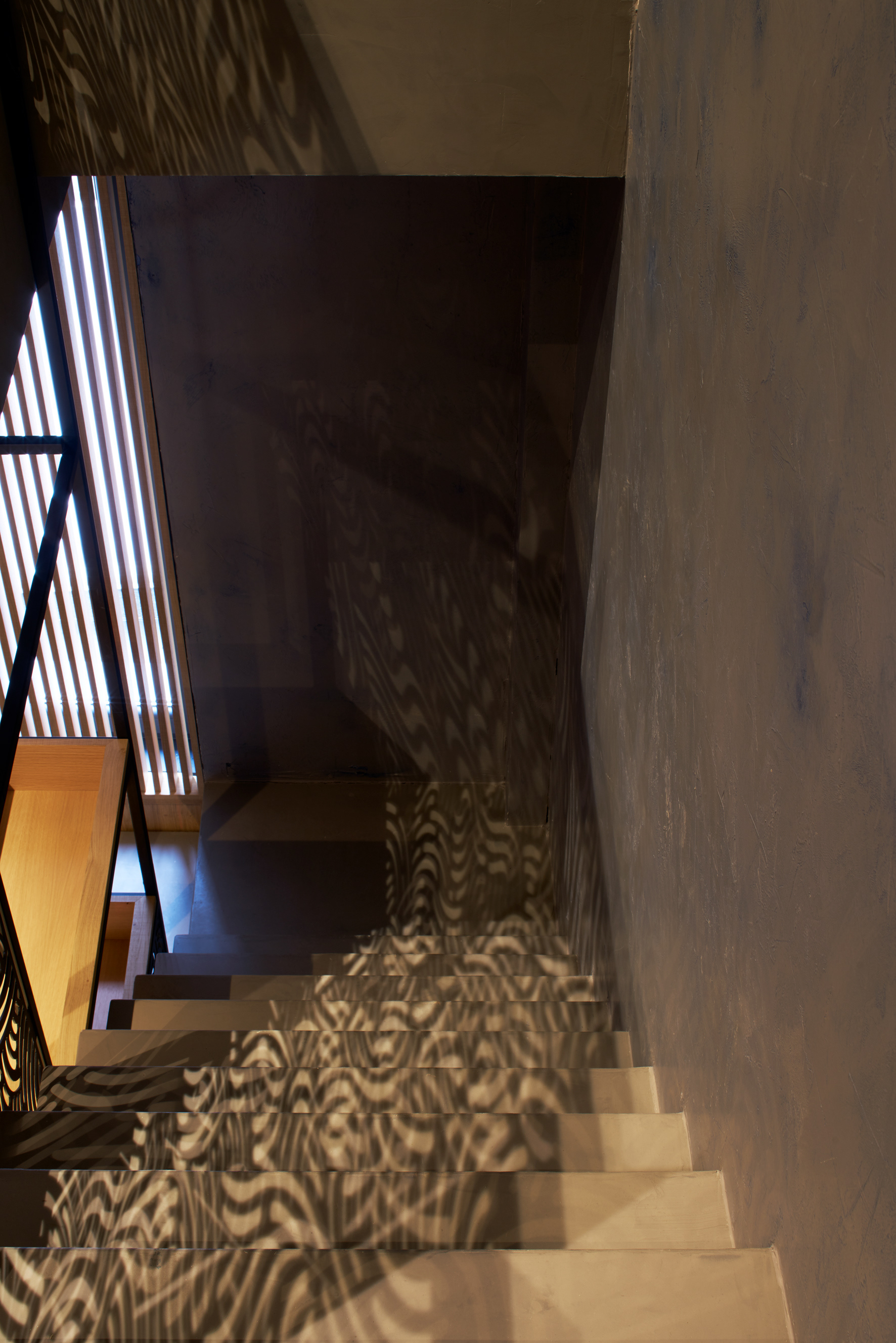
The noodles got physical and were used to form semi transparent closures resulting in a nice play of shadows.
Everything comes together
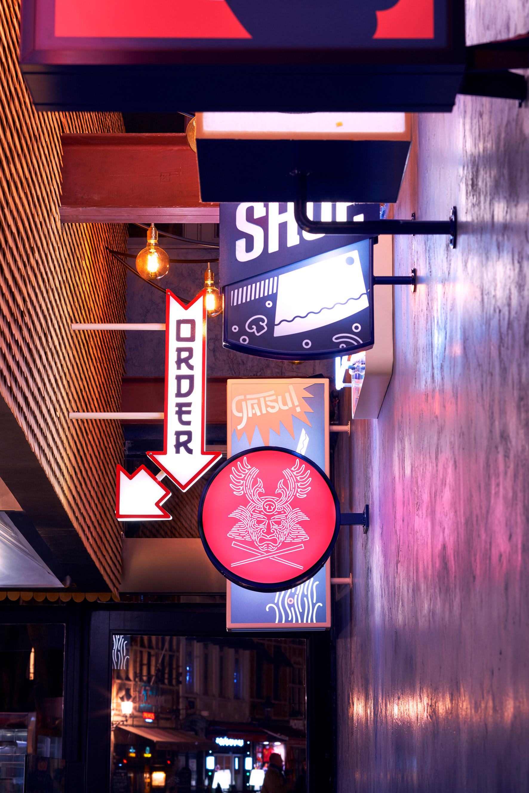
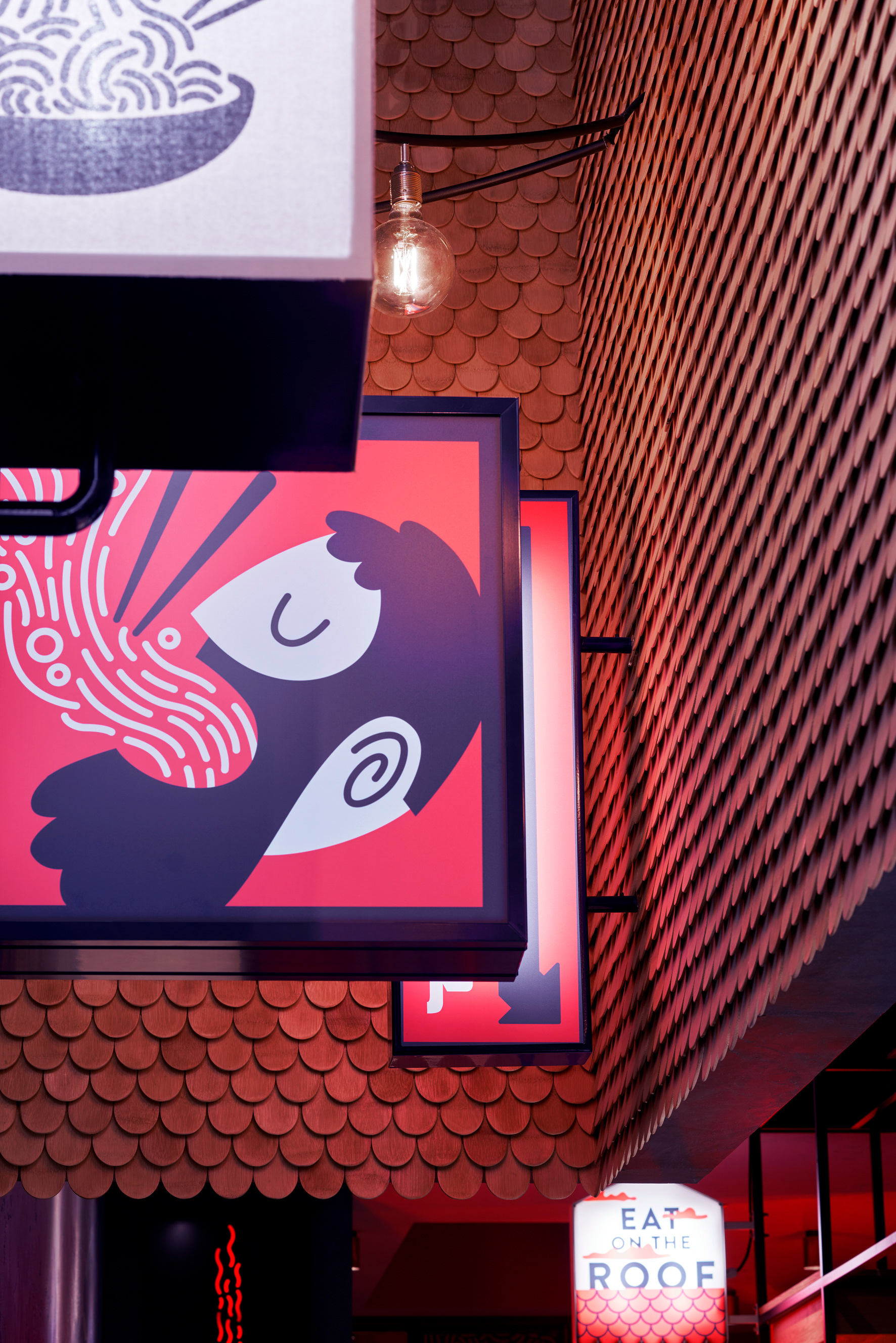
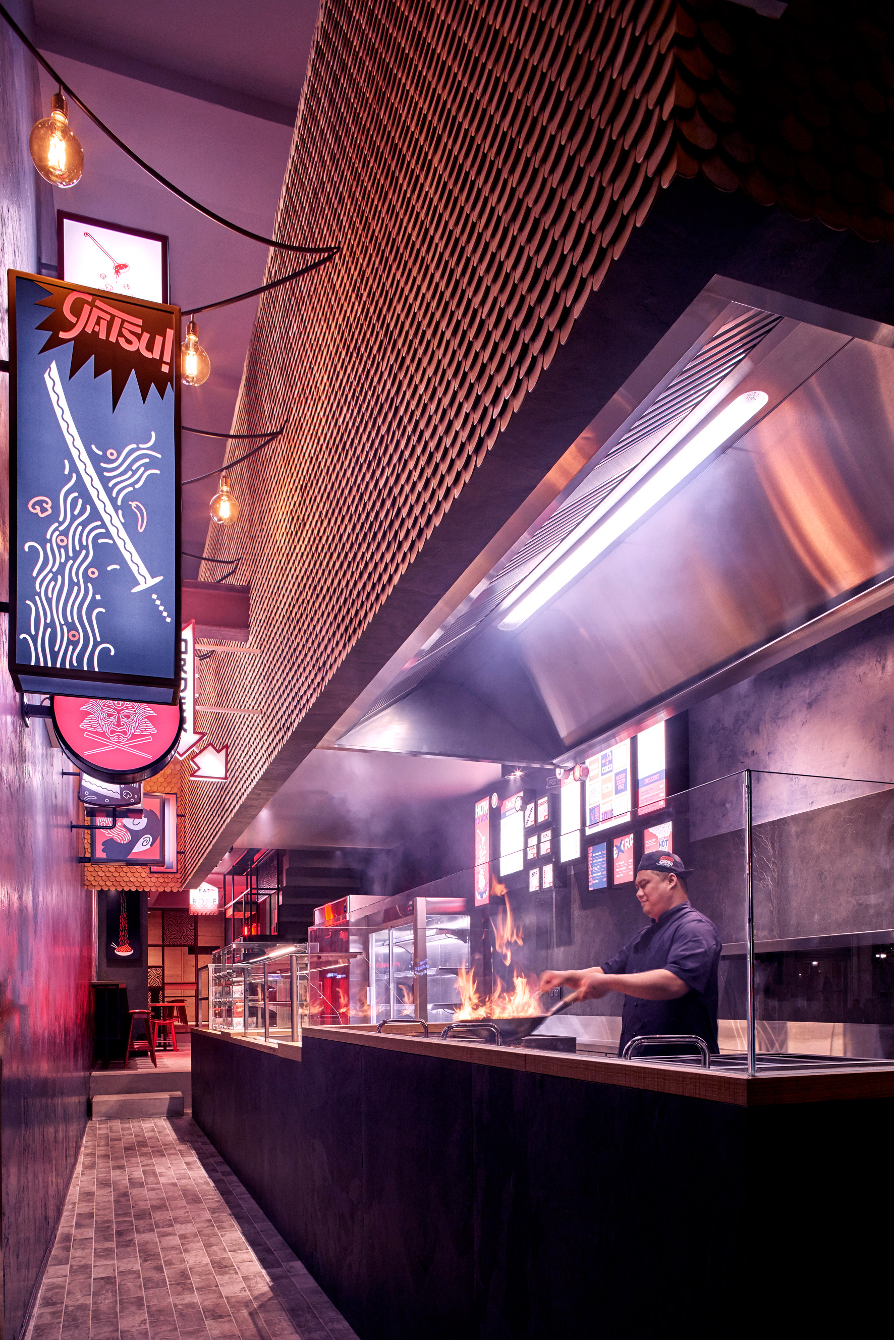
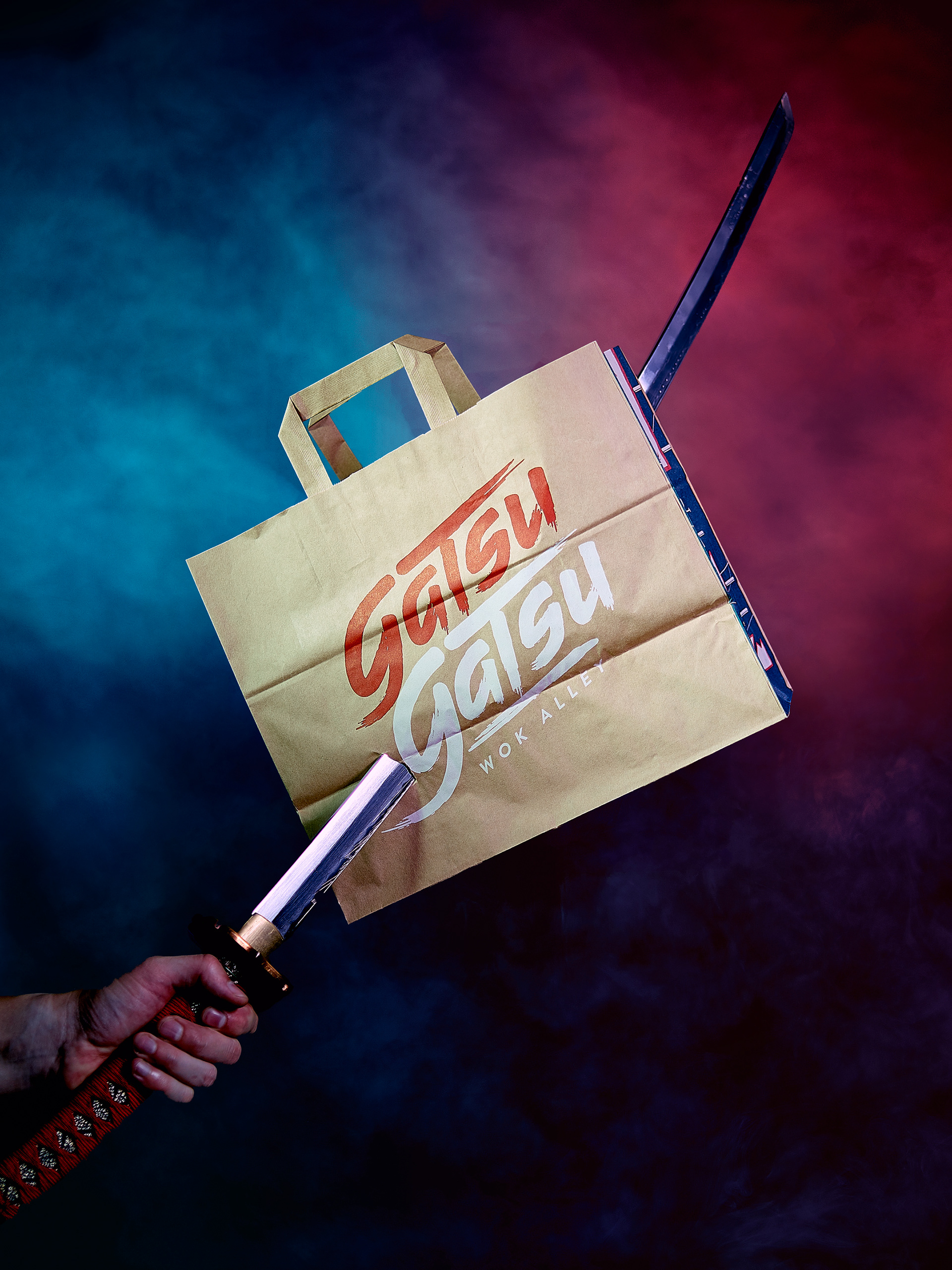
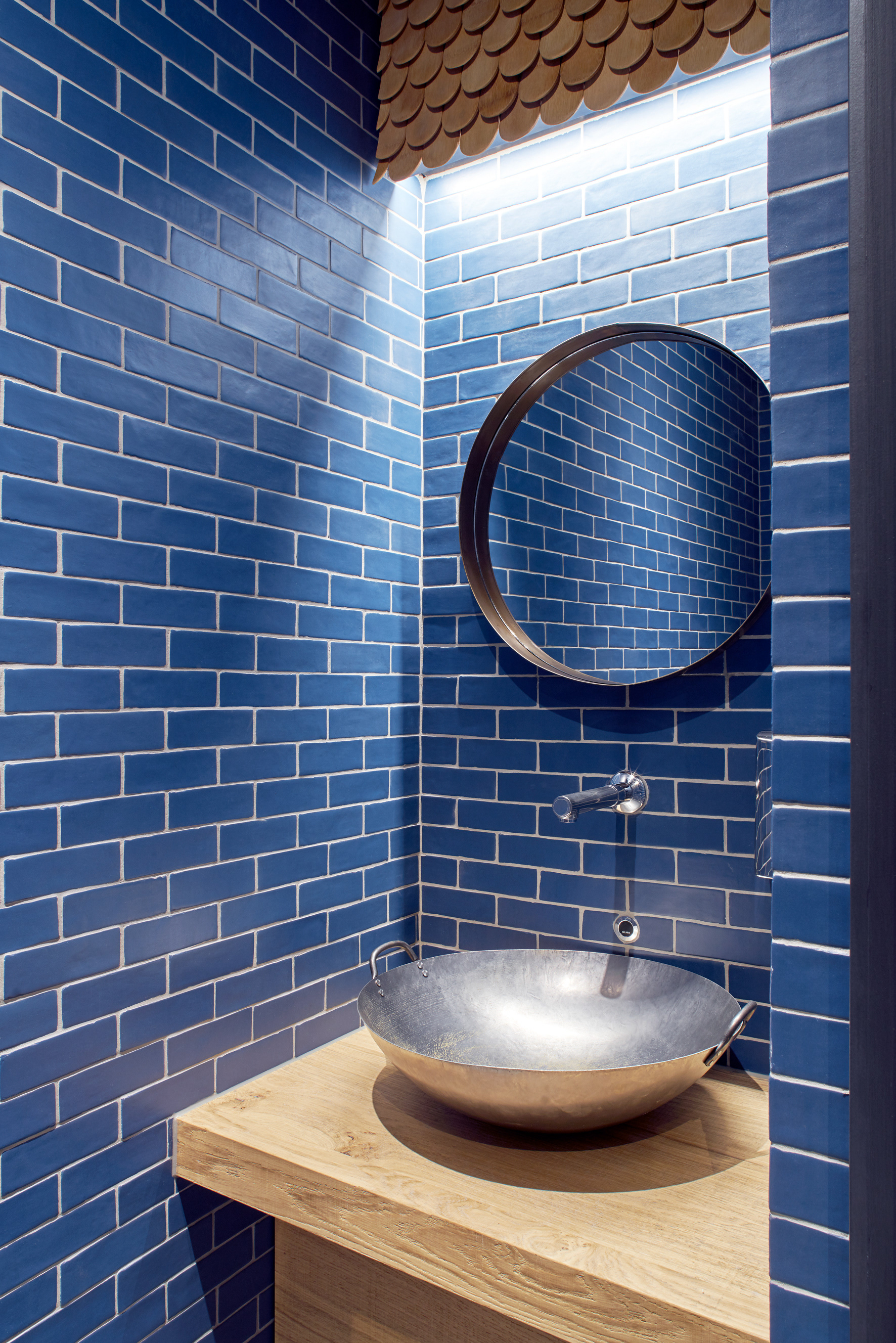
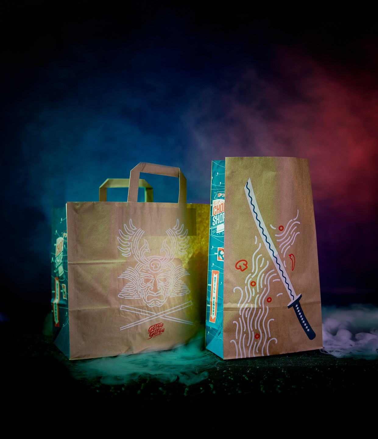
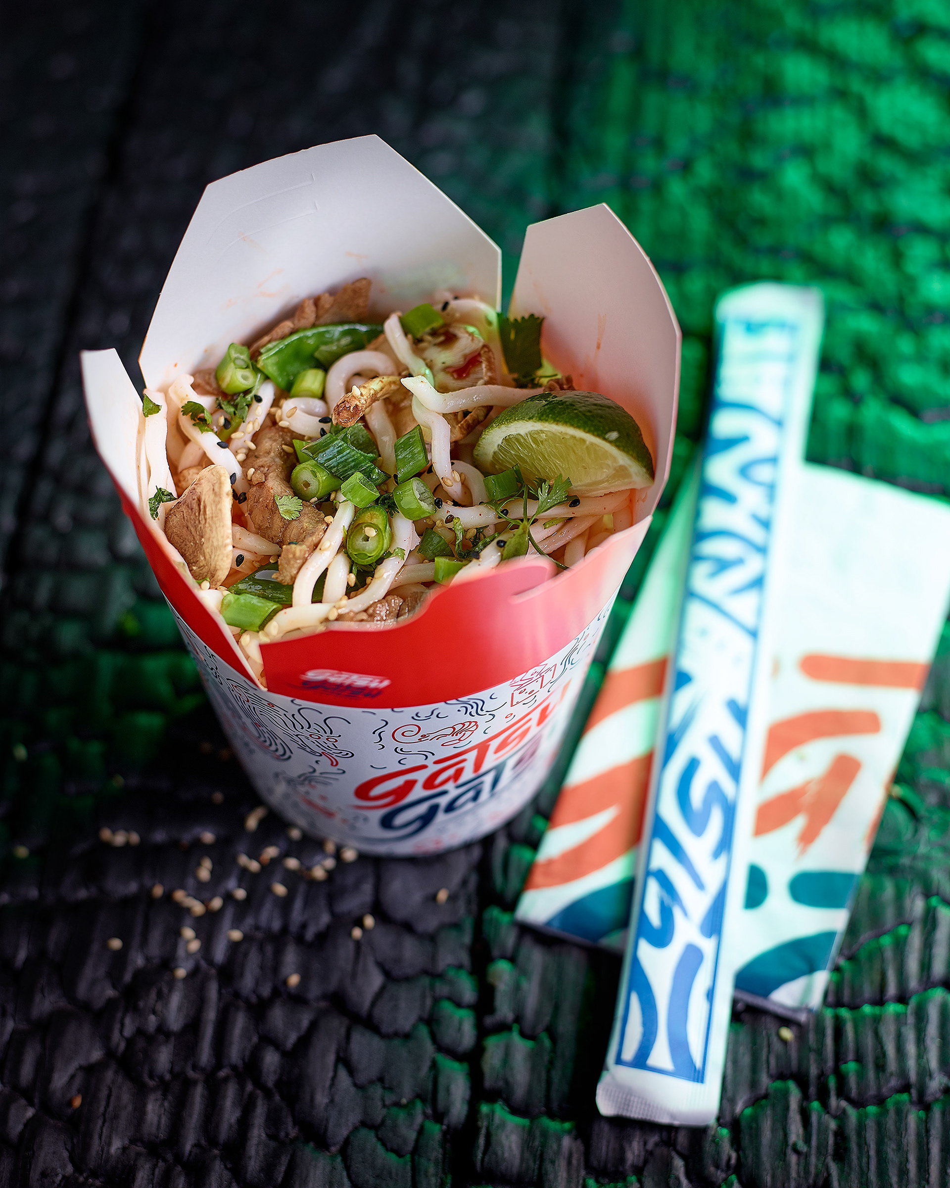
Our identity took reference from the weird and crazy visuals in Asia, as well as the contradictions and overload of information, even some tongue in cheek humor when it comes to sound in language. We did however curate our wild inspiration by applying it all to a strict canvas of samurai red and traditional asiatic blue.
"Chop chop and come on over to
Brussels newest wokspot and live
the emergence for yourself"
Check out our full portfolio
